Ben Shneiderman is an American computer scientist with deep expertise in human-computer interaction. Many of his contributions are foundational to the field — for example, the invention of the treemap visualization. Over the course of his career, Shneiderman distilled a set of principles from research and practice that apply broadly to interactive systems.
His eight golden rules are intended to help designers identify and solve usability problems. When applied well, they lead to interfaces that are intuitive, efficient, and satisfying to use.
Whether it is the layout, the size of the button, the color code or the tone used when writing the page, it is important to be consistent throughout the site. This consistency will allow you to develop your identity and not lose users as they navigate your site.
In the example below, notice how Amazon maintains consistency across its pages: the layout follows the same structure, buttons are similarly sized, and the color palette is unmistakably Amazon.

Allow your users to access all parts of the website with a minimum of clicks. To do this, you not only need to establish a good hierarchy in the menu, but also make things clear.
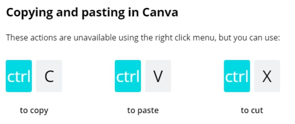
Consider incorporating features like keyboard shortcuts or macro facilities that let experienced users work faster. Canva, for example, supports keyboard shortcuts for common actions like copy and paste.
When users perform actions on your website, display feedback immediately so they know the status of their request.
Here is an example using Google Drive, a tool many professionals use daily:

Every sequence of actions should have a clear ending. Depending on the context, this might be:
By signaling that a task is complete, you reduce cognitive load and give users confidence that their action was successful.

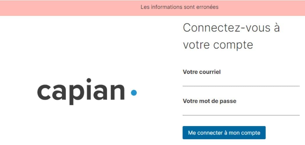
A good interface should be designed to avoid errors as much as possible. However, if something goes wrong, your system should make it easy for users to understand and resolve the problem. Simple ways to deal with errors include displaying clear error notifications and descriptive hints to resolve the problem.
For example, on our site, we tell you when you log in if your login information is wrong.
Immediately discovering that it is easy to choose "Cancel" after making an error is a very good thing for the user. If your users know that there is an easy way to solve a problem, they will feel less anxious and more willing to explore the options.
The rule can be applied to all operations or groups of operations.
For example, here we are in the Outlook mobile application, when archiving an email, a small window automatically appears at the bottom of the screen offering to cancel the archiving.

Users should feel that they are in control of the system, not the other way around. Give them the ability to customize their experience and make their own choices.
In the screenshot below, YouTube lets users choose their notification preferences — whether to receive all notifications, only personalized ones, or none at all. This kind of control reassures users that the system respects their preferences.

The limitation of human information processing in short-term memory requires that displays be kept simple, multiple page displays be consolidated, window-motion frequency be reduced, and sufficient training time be allotted for codes, mnemonics, and sequences of actions.
Avoid overloading your site or application with information of the same level. You have to deduce which ones should be placed first or you will lose the user's attention. No matter where you place your site, whether it's the home page or the menus, make sure that your user can't be distracted by unnecessary information.
For example, Capian's home page below is very minimalist and allows the user's attention to be focused on the "call to action", most of the information we want to promote is on the page without any other information that could disrupt the user's navigation.

Shneiderman's rules are not rigid mandates, but they provide a clear framework for evaluating and improving your interfaces. They apply to most digital products you will encounter.
Other heuristic frameworks complement Shneiderman's rules and can deepen your evaluations:
Ready to apply these rules in a heuristic evaluation or expert review? Try Capian for free.