Example of a quick UX review: Québec Outfitters
By Laure Gabrielle Chatenet
2017-06-02
Website context
The Outfitters of Québec serves to bring together all outfitters across the province of Québec, with the aim of offering different activities and accommodation for hunting and fishing enthusiasts.
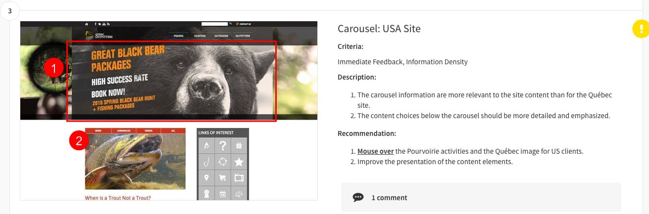
Although they have a strong visual uniformity backed by a consistent brand message, Quebec Outfitters’ site uses carousel and use of place-name lists rather than interactive maps was addressed by our audit.
 View full UX audit for this site
Key findings
Our evaluation identified several areas for improvement:
- Carousel reliance — Important content was buried in rotating carousels, reducing discoverability. Static featured content would better serve users arriving with specific goals.
- Navigation by lists vs. maps — Place-name lists are less intuitive than interactive maps for a geographically-oriented service. Users looking for outfitters near a specific region had to scan long lists instead of browsing a map.
- Visual consistency — While the brand identity was strong, some pages broke the visual pattern, creating moments of confusion.
Before slipping into your waders and stepping out to fish in the Québec wilderness, read our Quebec Outfitters audit and peruse their site!
Explore our UX audit use case to learn how Capian helps teams conduct thorough interface evaluations.