UX Review of the Uber mobile App
There's been a lot of talk about Uber in the recent years. There is a lot of political, social, financial and economic debate around the company and we hear about it all the time (personally, I can’t take it anymore).
Innovation almost always breaks things and disturb. When the railroad arrived in the countryside, critics said that this "automatic machine" would make the cows go crazy. Until proven otherwise, it was not the railways and steam locomotives that made them go crazy!
Leaving aside all these legitimate debates, there is much to learn from Uber and its rise. What if we were inspired by what was achieved and try to understand the path of their success and their product in a more global way?
This is what we are doing today with this UX review (which also covers a bit of the "business" aspect). We had a look at Uber's evolution through its website, brand, mobile application release, and quest for excellence in the customer experience. Perfection does not exist, even at Uber, and we took the opportunity to identify improvement opportunities for the application.
 View full UX audit for this site
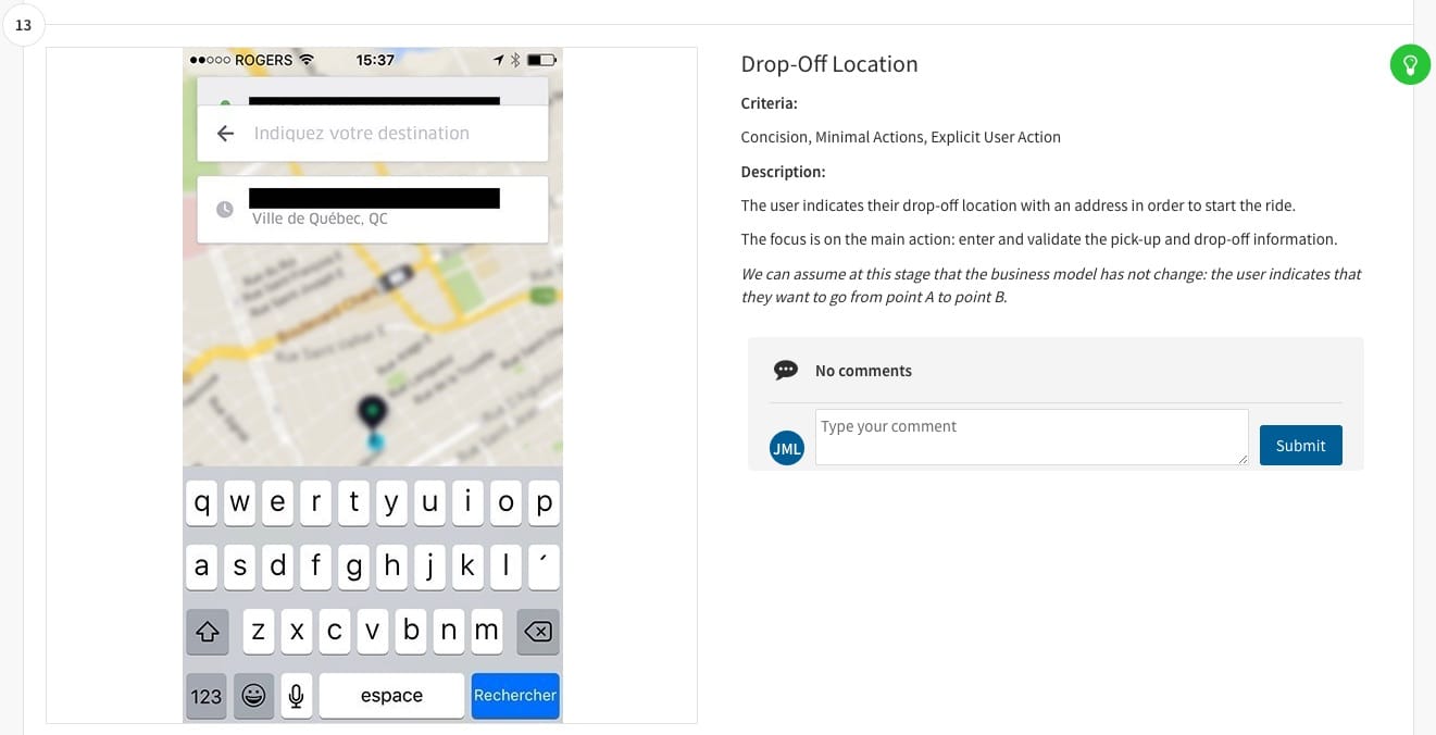
Progress and innovation are the driving forces of a company and design and customer experience are at the heart of it. Success does not happen overnight, and to understand why it happened we need to keep in mind all the things that led to Uber being as big.
This evaluation was carried out with Capian, the software par excellence for UX reviews using the Bastien & Scapin cognitive ergonomics grid and is based on proven objective criteria. Evaluator: Laure Gabrielle Chatenet, proofreader: Jean-Michel Lacroix.
To receive our next evaluations, subscribe to our newsletter. We will share articles from this blog, including reviews and some occasional news about Capian.